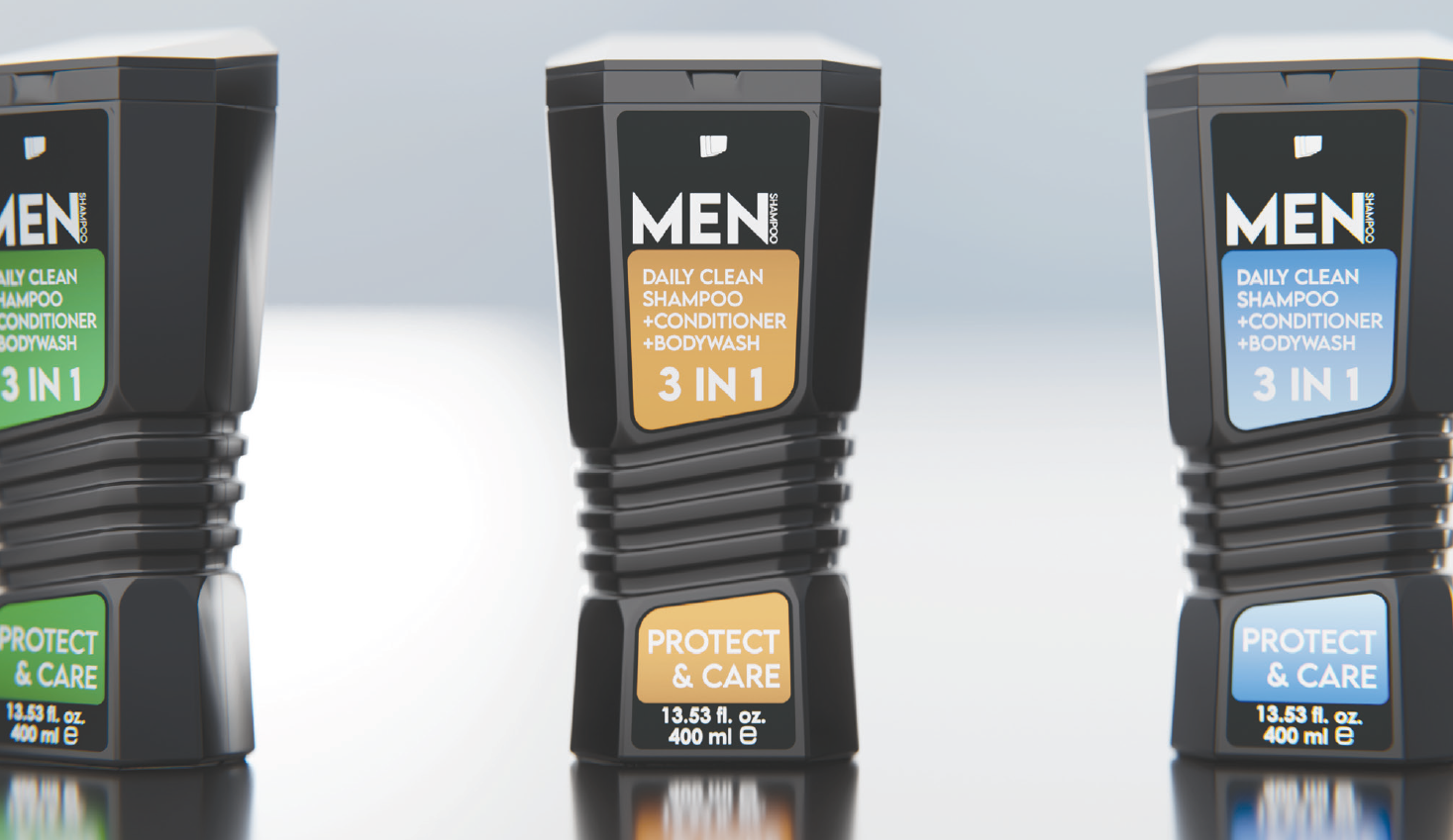
This was a 5-week project focused on designing shampoo packaging using product semantics. Each student was randomly assigned a product identity (such as "natural," "pro," "kids," etc.) and asked to design a shampoo bottle that visually communicates this identity through form, color, material, graphics, and interaction.
🧠 Project Explanation
Students designed shampoo bottles that reflect different product identities through visual and physical design features, without relying on text.
Project context
This was the first project of the 3rd-year industrial design studio. It aimed to introduce students to the concept of product semantics and how design choices shape user perception.
Teaching approach
The project followed a structured weekly process—starting with research, followed by ideation, detailing, and final mock-up production. Regular critiques and peer feedback supported the learning.
Key points
- Focus on how products communicate meaning through design
- Emphasis on user perception and identity
- Clear final outcomes including mock-ups and presentations
- Studio work, wall critiques, peer reviews, and a final jury